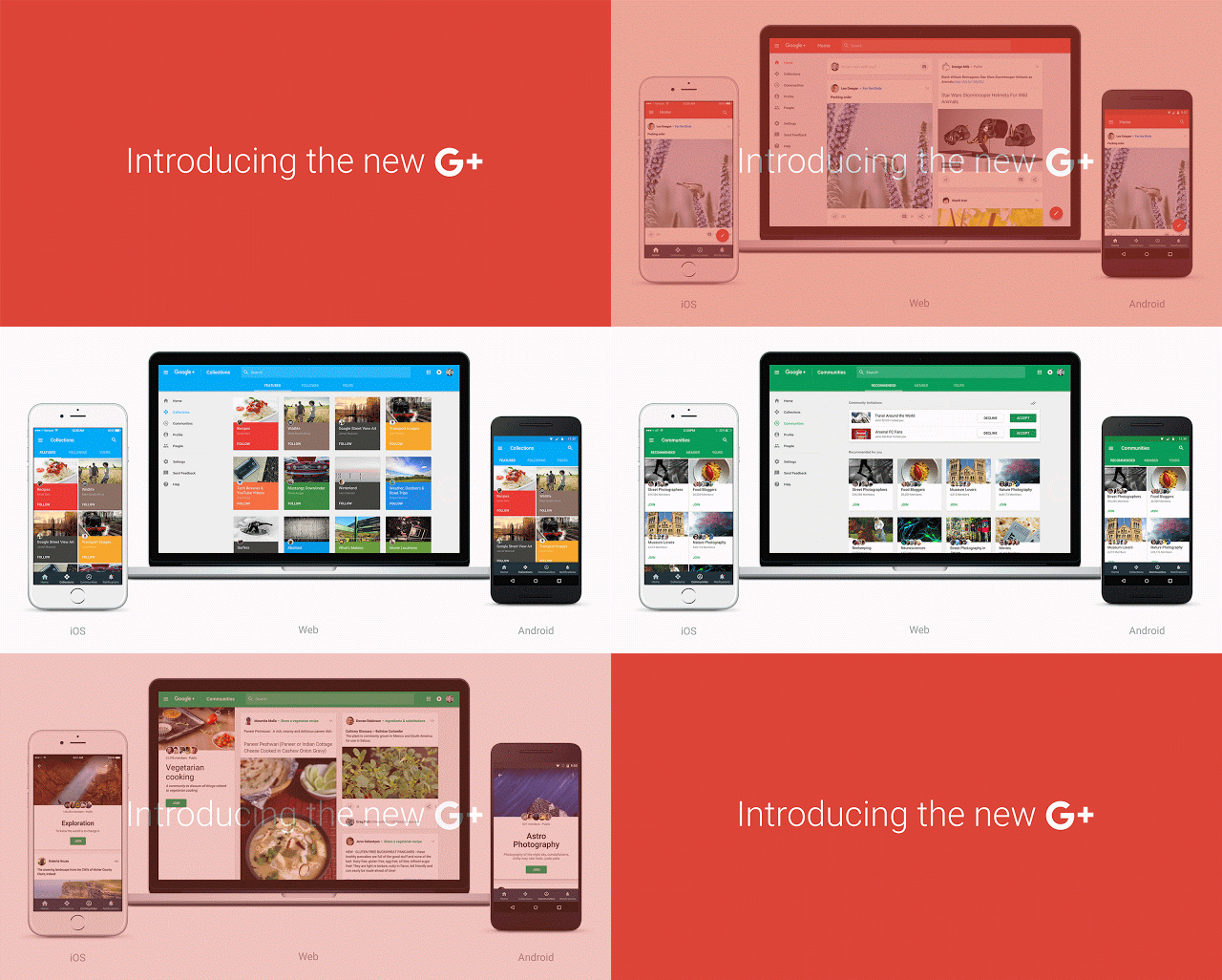
Let’s welcome the new Google+ design which Google has rolled out on Tuesday (November 17, 2015)! Google has announced the revamp to its social network, now we can see the outcome is very fine tuned resulting on building collections and communities as the main focus.

If you do not see the new Google+ design in your account, here’s what you have to do:
- Login to your G+ account
- Go to ‘Settings’ pane > ‘Manage other apps & activity’
- Click on ‘Manage Google+ activity’
- Then, click on the search bar at the top
- That’s it, you can see the new G+ design
Doing this will enable you to the new Google+ and from your next visit you will be seeing the new layout!
The new Google Plus redesign has a bold red action bar with a hamburger menu, which replaces the current drop down menu and it this new design also enables you to post quickly!
![]()
Many users have reviewed the new G+ to be faster, more consistent and gave enhanced performance across web and mobile devices. Previously in March, Google+ was divided into Photos and Stream Products. Now, it has given importance to collections and communities making it a better way to organize and keep your favorite interests.
Google also said that a similar new layout design will soon be updated to Google Plus Android and iOS App users.
